
A Website That Looks as Specialized as the Business
CorporateYou produces and finishes corporate wear, workwear, event clothing, and promotional textiles for business clients. Its offer covers embroidery, flex printing, DTF, DTG, sublimation, latex printing, and textile processing under one roof.
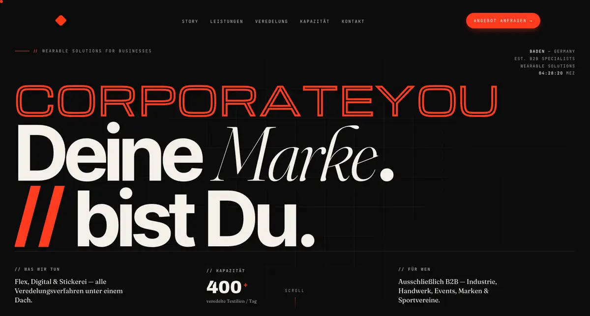
The redesign presents that range through a focused one-page experience. Large type establishes the brand, production details explain the work, and the page keeps the quote request visible from the opening screen onward.
What the Redesign Needed to Communicate
Lead With the B2B Position
Make it clear from the first screen that CorporateYou works with companies, agencies, brands, and sports clubs rather than one-off consumer orders.
Explain the Production Range
Turn a technical list of finishing methods into a page that buyers can scan and understand quickly.
Show Capacity and Control
Give production volume, in-house embroidery, processing, and logistics the same weight as the visual brand.
Industrial Precision With an Editorial Voice
The visual direction uses a near-black background, warm cream text, and signal red accents. Oversized headlines carry the personality, while a measured grid and compact labels keep technical information ordered.
A Brand Built for Recognition
Expressive Typography
Outlined lettering, heavy sans serif type, and high-contrast serif text give the page a distinct rhythm without hiding the message.
Production-Led Imagery
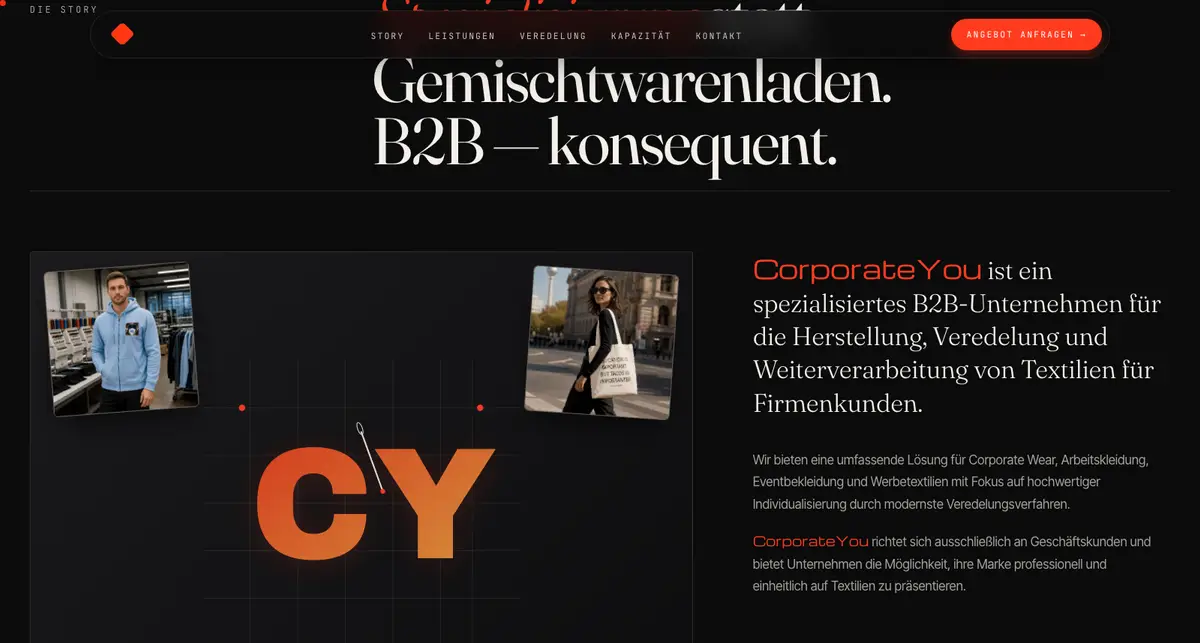
Workwear, embroidery equipment, and finished textiles connect the visual identity to the work performed in-house.
Controlled Color
Signal red marks calls to action and key facts. Cream text keeps long sections readable against the dark interface.
The Sales Story in One Continuous Page
Story and Positioning
The opening sections define the company, its business-only focus, and the promise behind the brand.
Services and Methods
Core services and seven finishing methods are separated into readable blocks with short practical descriptions.
Capacity and Contact
Production volume and the quote request appear as decision-making information, not footnotes at the end of the page.
A Responsive Page With a Clear Sales Path
The final page moves from positioning to services, production methods, capacity, target industries, and reasons to choose the company. Each section answers a question a business buyer is likely to ask before requesting a quote.
The responsive build keeps the oversized type and strong grid while adapting them for smaller screens. Navigation, section labels, and repeated quote actions help visitors move through a long page without losing their place.